Dark that sells discipline
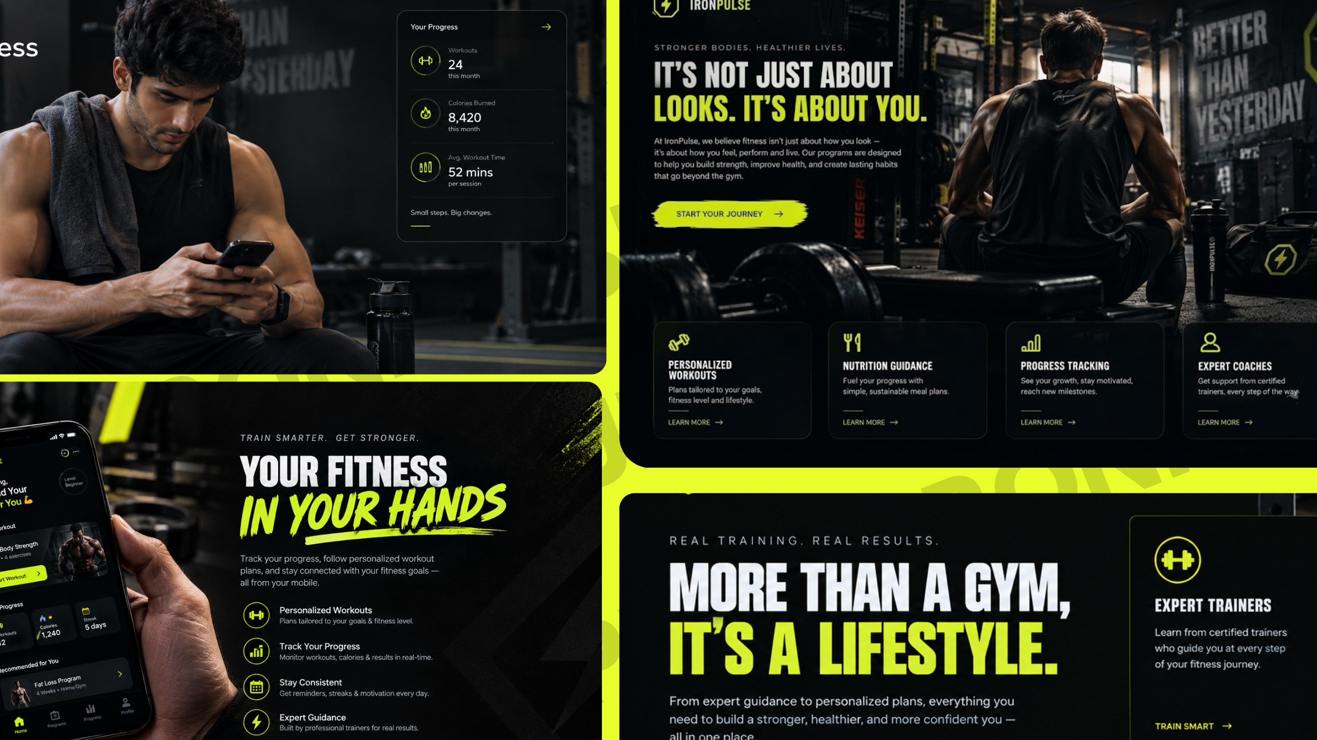
A cinematic black grade with volt-neon accents — the brand reads premium and dangerous, never template.
Three reps, one lockout — the demo reel earns its screen time.
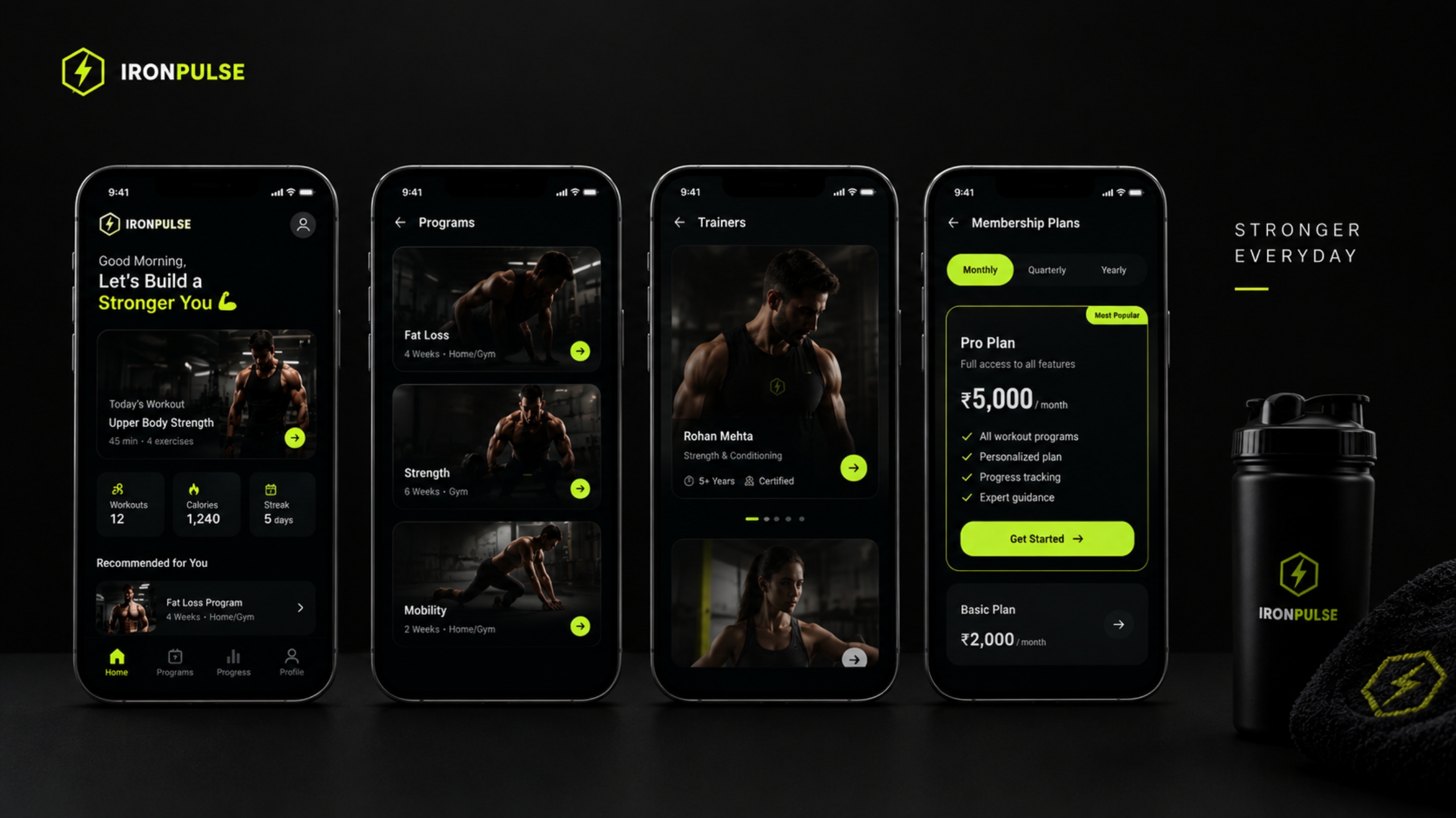
booking flow, training floor, membership dashboard.
Three reasons the Iron Pulse site feels like the gym itself — heavy, precise, unforgettable.
A cinematic black grade with volt-neon accents — the brand reads premium and dangerous, never template.
Every scroll behaves like a rep: pinned sections, slam reveals and snap easing. Zero lazy animation.
Viewport-gated video, pure-CSS FX and clean Core Web Vitals — the page loads light and holds 60fps.
Born from iron and discipline, IRON PULSE isn't just a gym. it's a proving ground where ordinary people forge extraordinary versions of themselves.
Every rep, every drop of sweat, every early morning session adds to the pulse that defines us. Wipily translated that pulse into pixels: cinematic darkness, volt energy, and motion that never misses a rep.
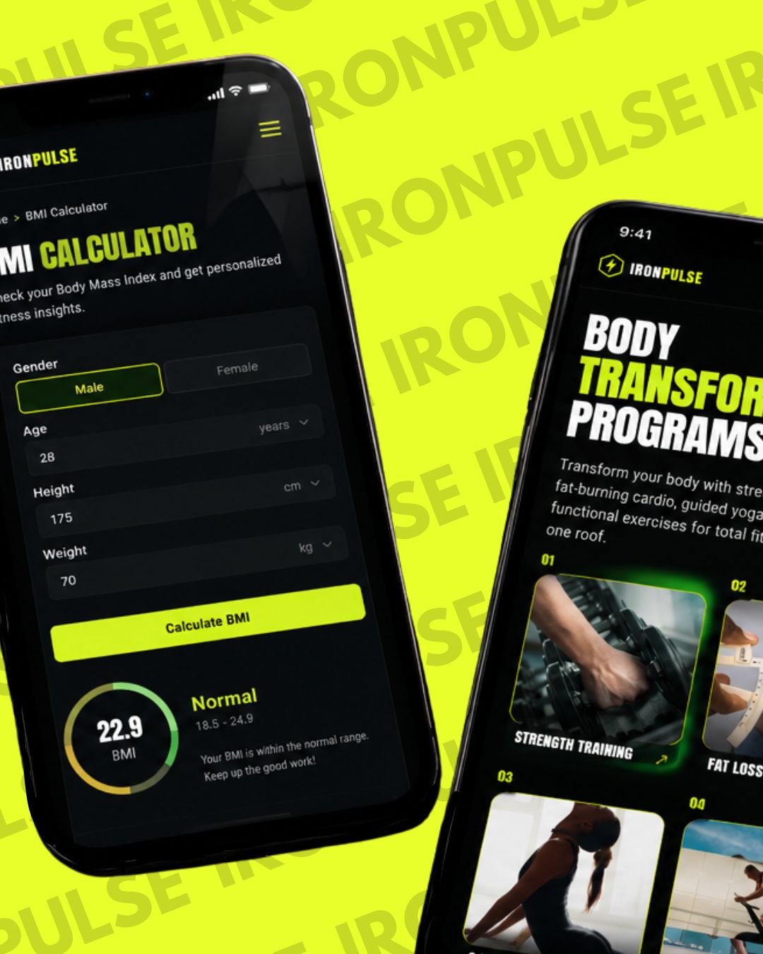
Seamless Everywhere
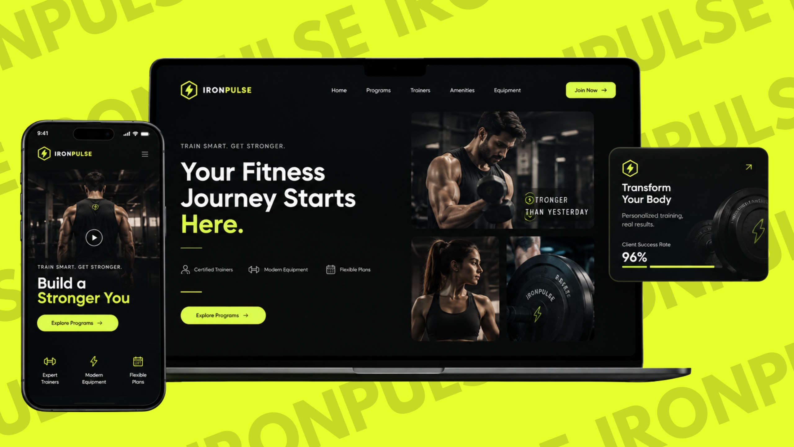
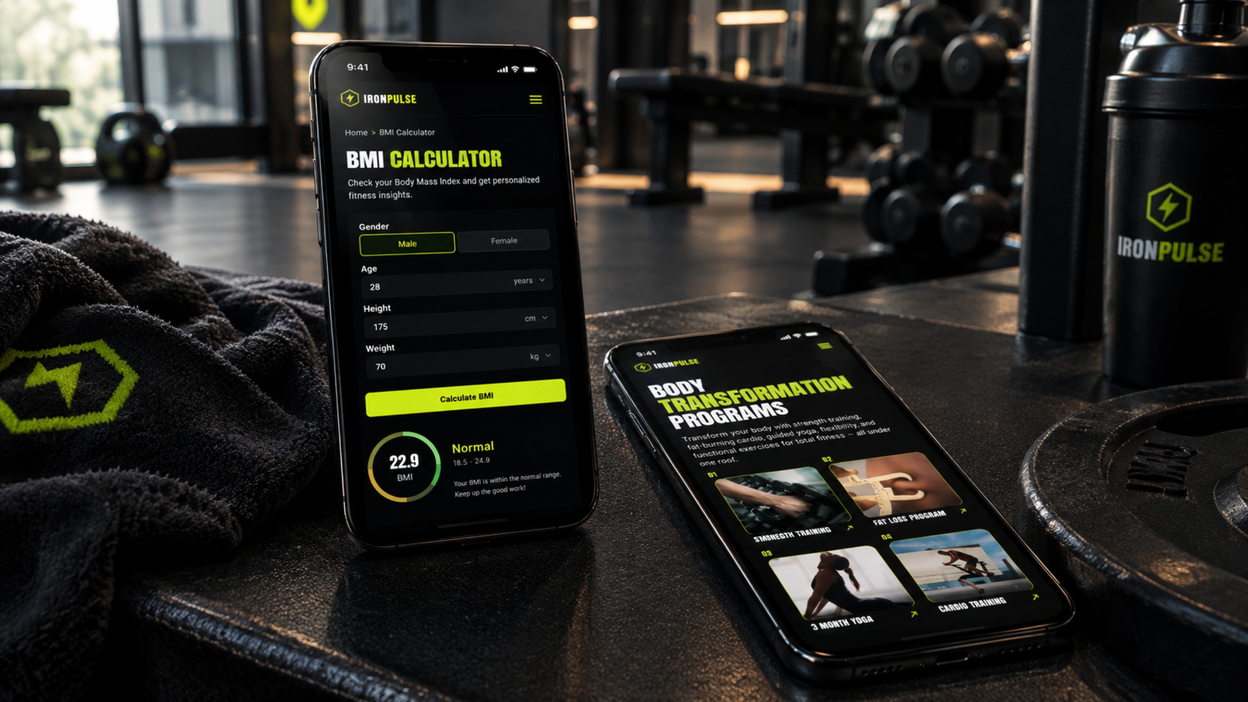
02Desktop, mobile and tablet one pulse, every screen. Responsive grid, thumb-safe CTAs, zero horizontal scroll.
We studied how gyms sell and why most feel like templates. Iron Pulse needed a visual system that reads heavy at a glance: black like a loaded bar, volt like the spark between reps, type that shouts without saying a word.
click a swatch — hex copies
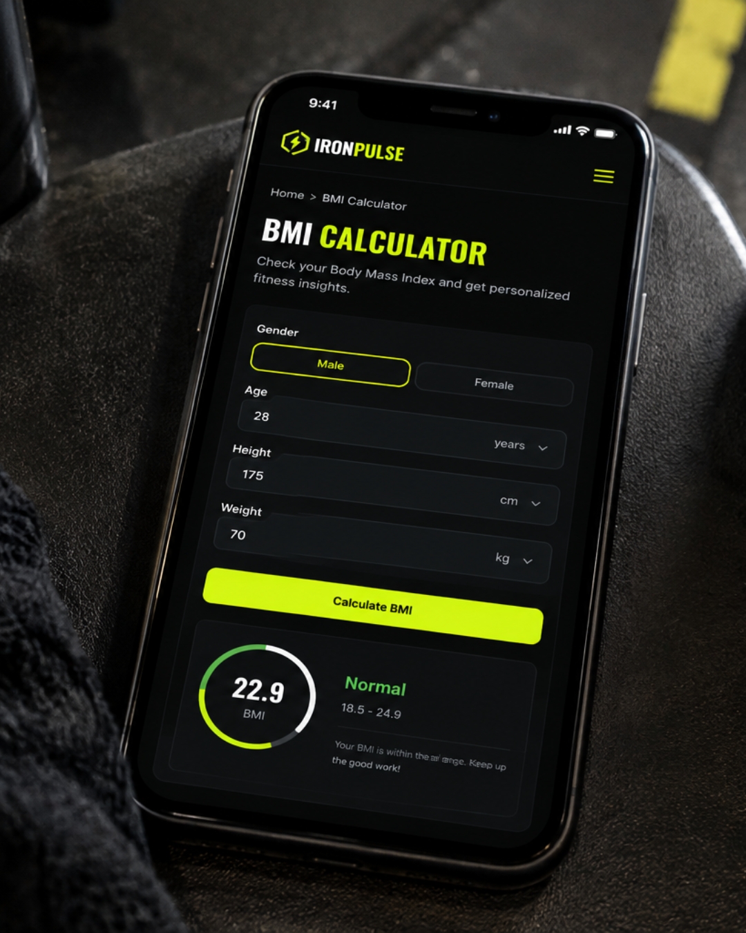
Plate geometry study — the grid behind the glow.
The visual language borrows from strength sport: chalk-dust contrast, plate geometry, hazard-tape discipline. Every glow is earned volt only fires where the eye should land next.
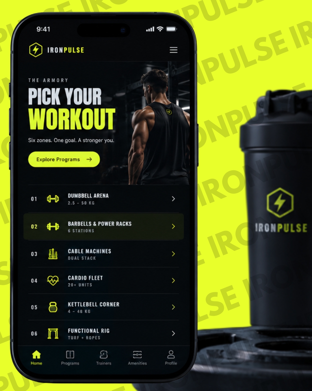
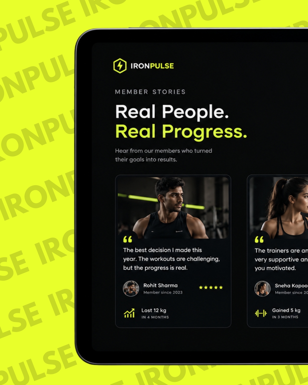
06One take. One grade. Volt boundary wraps the frame the video breathes inside it.
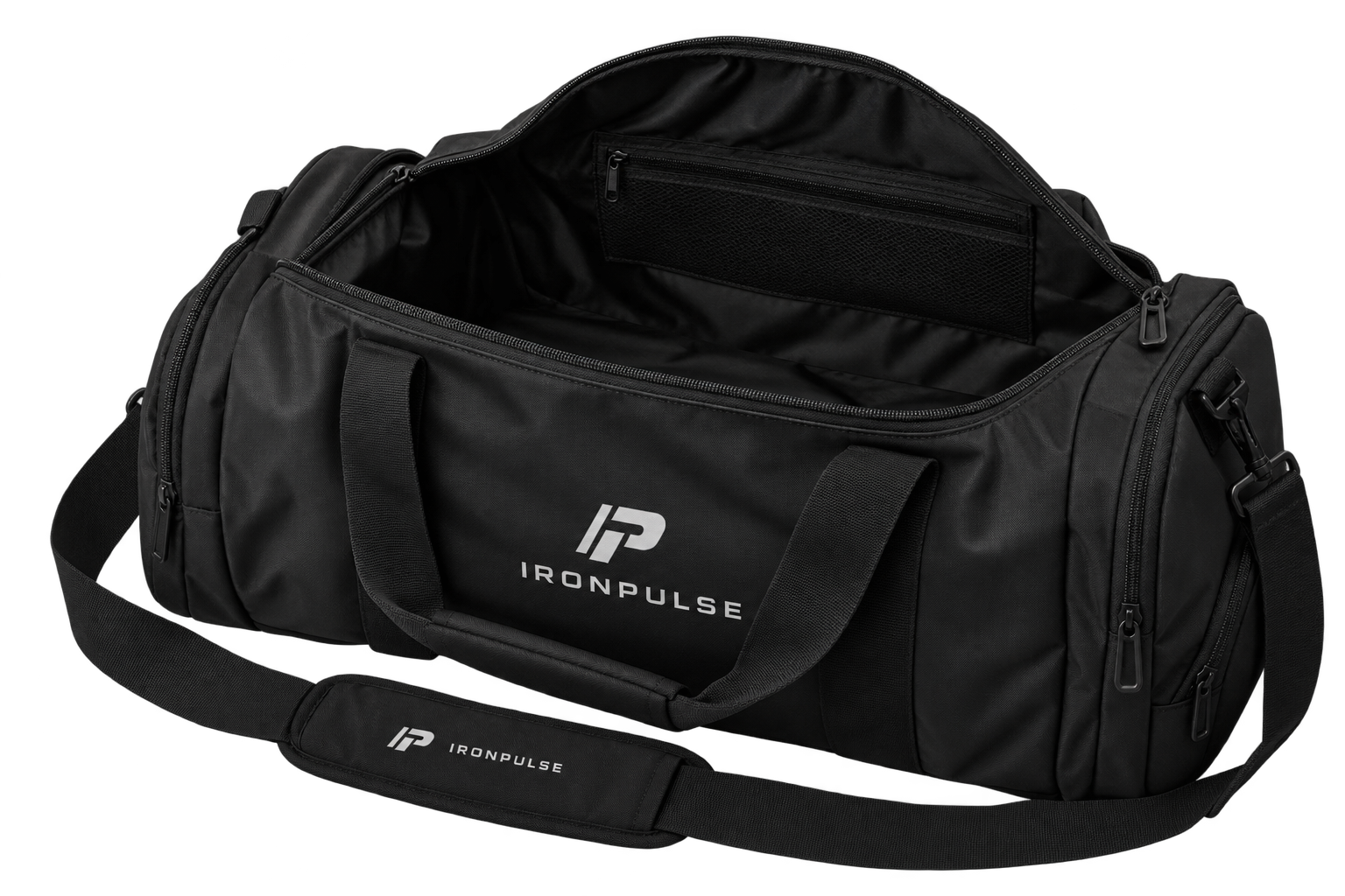
Four things every Iron Pulse build ships with pulled straight out of the bag.
Angular cuts, volt accents, zero clutter every pixel earns its place.
Viewport-gated video, pure-CSS FX, lazy media lifts before you scroll.
Transform-only animation and pinned sections that hold frame mid-rep.
Sticky CTAs, WhatsApp hooks, review-proof trust speed ends in sign-ups.

Strategy, design and motion under one roof let's build your next win.
Start a Project